Moving Average Is More Than What You Think – Part 1
Many traders after being in the business for couple of years will start to dismiss many things they have seen, be that moving average, stochastics, MACD, etc. To these traders, these indicators are just useless, lagging, and somethings simply misleading.
Is that really so?
Moving average is supposed to divide the data series evenly
What moving average suppose to do is to properly partition the data series into 2 halves. 50% above the moving average and the other 50% stay below the moving average.
Most experienced traders already know that this is not true, because the distribution of the prices from the moving average is not really 50/50.
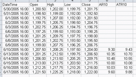
For example, here is a distribution chart of E-mini S&P 45-minute bar data, applied with a 9 period moving average. The distribution chart below will show you the bias,
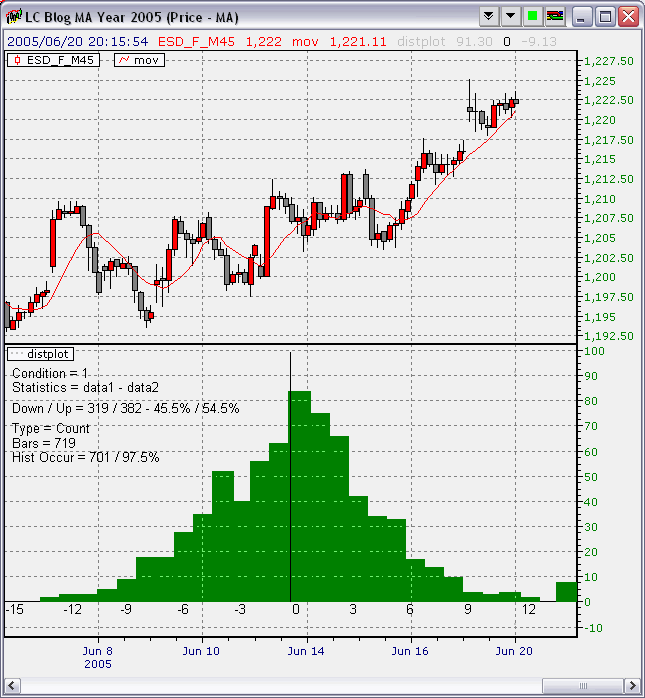
You can see from the chart that the distribution is not really that even and the scale is not good for comparison purpose, say, against data from 1996 where S&P was trading in a completely different range.
Since the moving average is not really doing what it is supposed to do, should we dump it for good?
Normalization against bar range holds the key
Lets look at it in another way before deciding what we are going to do.
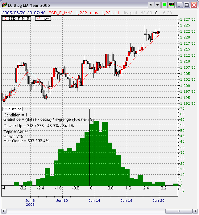
Instead of looking at the difference between the moving average and its underlying data, which does not provide a normalized view of the relationship between the data and the moving average, we can look at how far away the data is from the moving average, based on the average range of each bar in the data series, using the same number of periods as the moving average itself.
To be fair, this reference range should be the previous average range as oppose to the current average range, otherwise, the predictive quality would be lost.
The formula to use in the Distribution Plot indicator is,
(data1 – data2) / avgrange (1, data1, 9)
where data1 is the underlying data and data2 is the moving average.
Here is a chart for year 2005, using this new measurement method,
Here is the chart for year 2004,
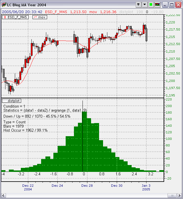
Notice how stable the distributions are when compared against each other.
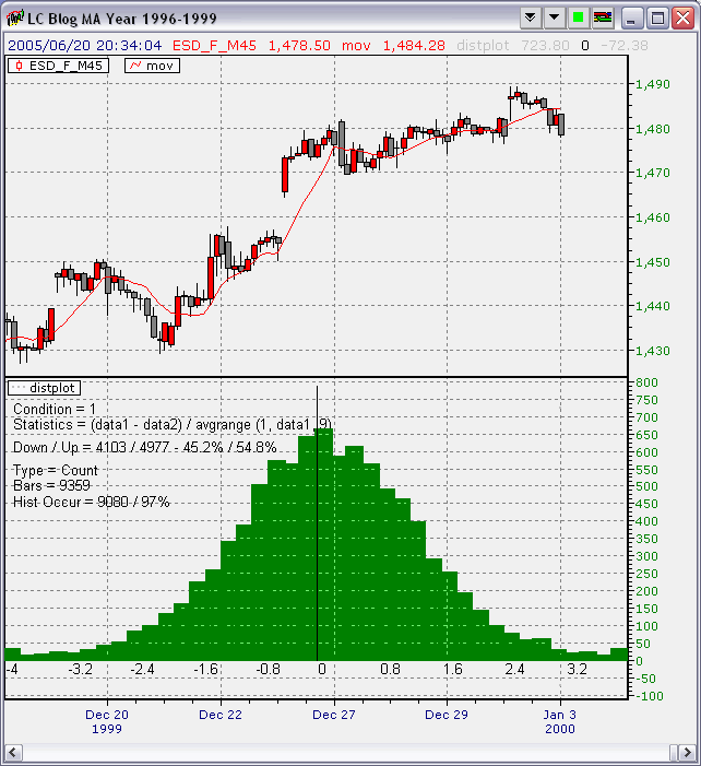
Here is another look at the distribution based on data from 1996-1999,
Here is the distribution based on data from 2000-2005,
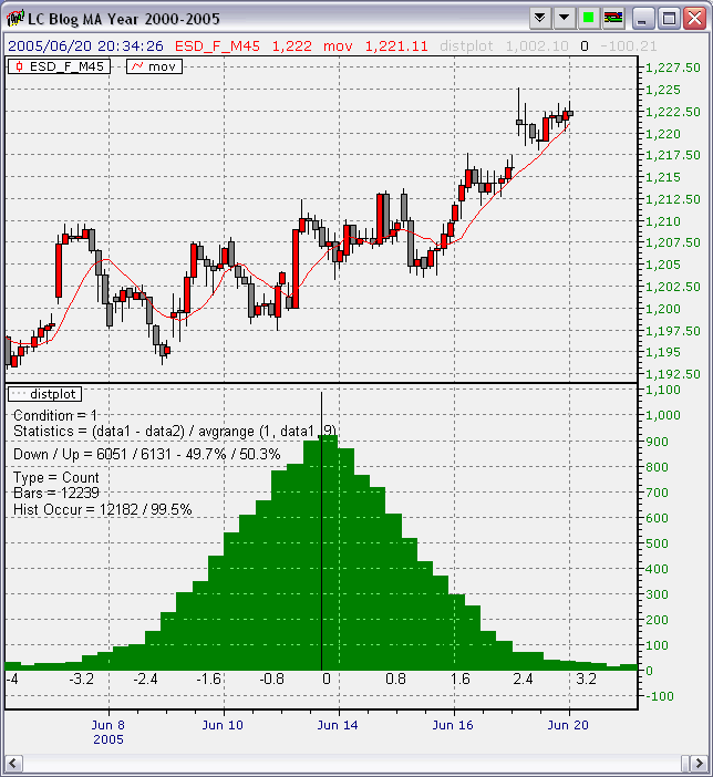
Comparing these two drastically different time period, we would have expected somewhat different distributions. But, to most people’s surprise, the distribution of this measurement is stable across all these times.
Summary
By properly measuring the moving average and its relationship with the underlying data, the moving average indicator can indeed perform what it is supposed to do. Next time when you read a chart with moving average, you will know what relationship to look for and focus on.